The Project
Bringing out the essential feature and use of ONEUP was neccessary to bring out throughout the site. The site framework focuses on brand and audience connection through shared values and interests. This helps to bridge the gap between purpose and product through content and storytelling.

Analysis
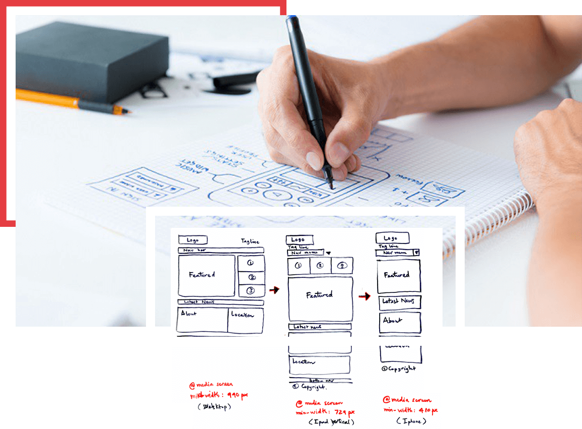
The new design layout has to followup on important features and carry the ONEUP character throughout. The bold imagery, the graphic texture and the use of icon depicting the procedure of using the product.

Design
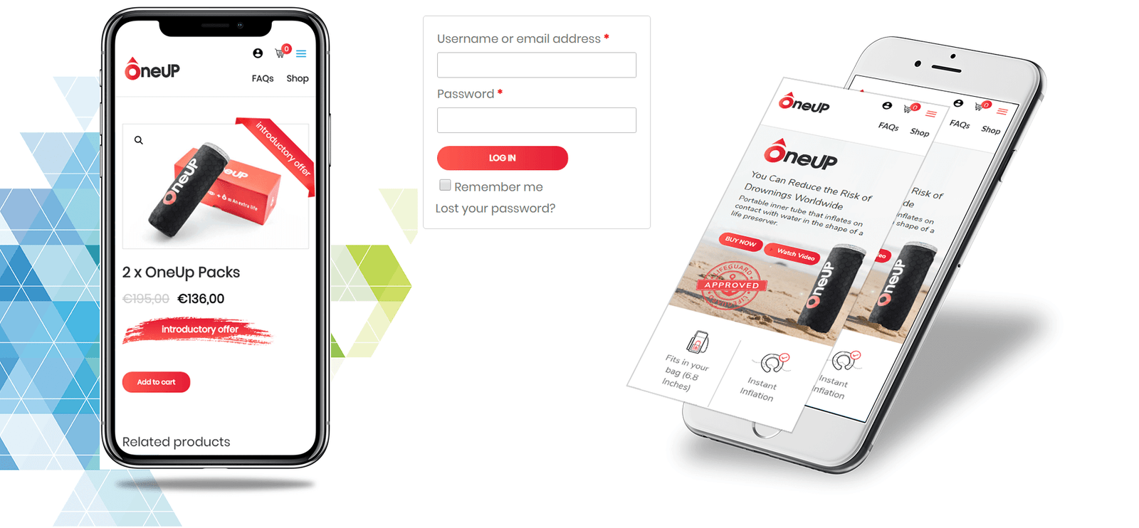
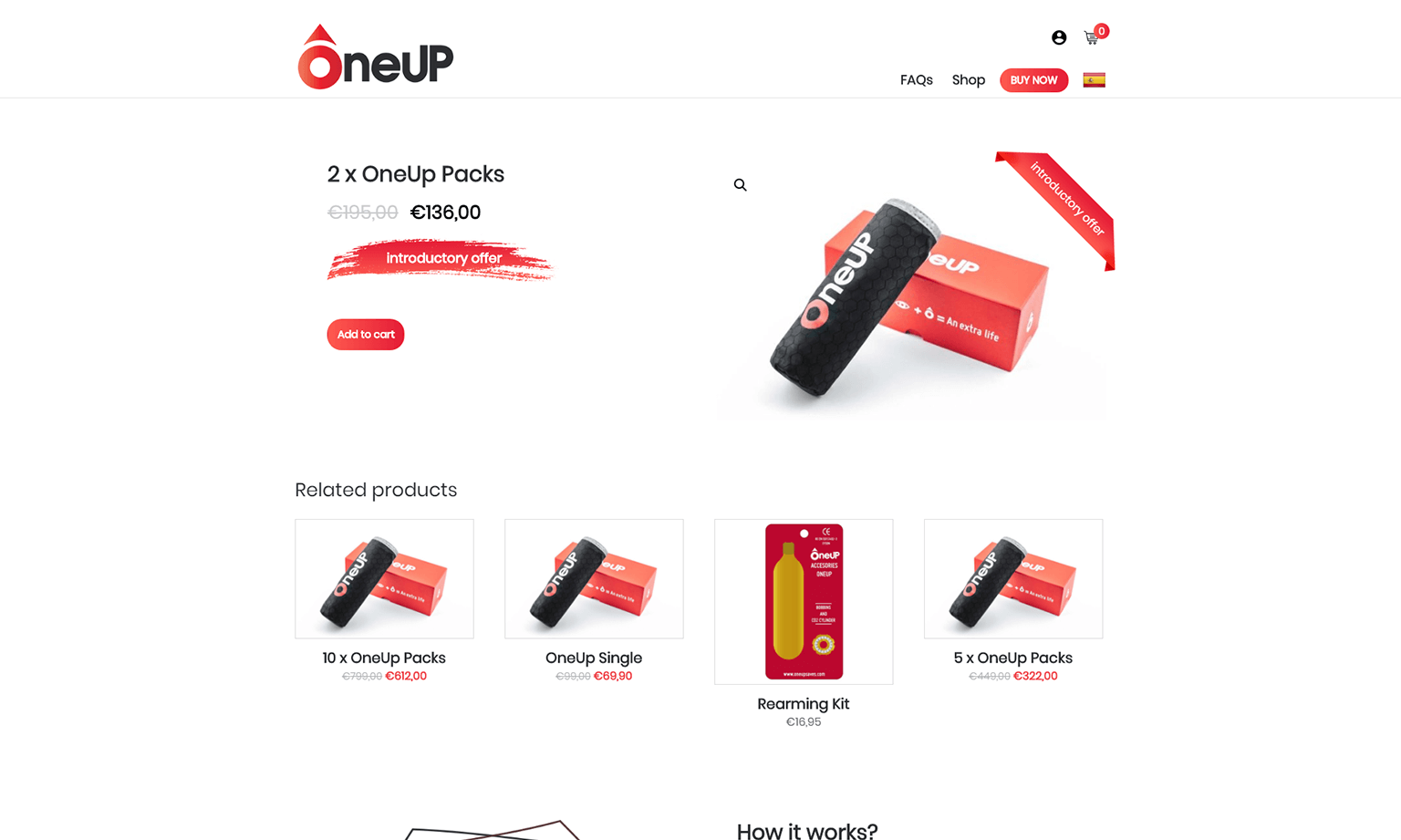
The design is kept eyecaching with bright red color combining them with subtle grey and creating contrast. Use of zig-zag flow design to guide customer through the images and text equally.


The Final Output
The result was a clean, modern and guided flow of website to guide customer in detailed manner for a better understanding of the Product. The descriptive graphics and icon library enhanced the visual interaction.


